2013 Poster
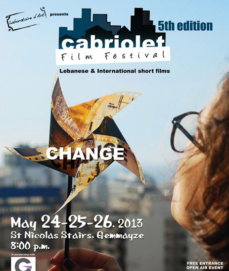
 The theme for 2013 was change, portrayed in a spinning paper fan in the hand of a young girl blowing at it to the background of a light blue sky and the industrial city, implying motion in an ever changing world where nothing is constant.
2012 Poster
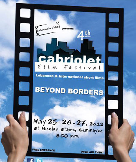
 The 2012 was beyond borders. The chosen concept was a transparent glass to depict the idea behind the chosen theme which was transcending borders. The light colours were used in order to attract the attention of the public, as our experience from previous years proved that dark colours did not generate the desired effect.
2011 LOGO
The logo was modified in order to establish a rigid identity which represents the essence of the festival. The adopted colors were dark blue to symbolize the screening of films which starts at 8 pm.
2011 Poster
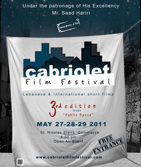
 It was the first year that a theme was selected for participating films. The 2011 theme was public spaces; hence, the chosen concept was a simple white cloth representing a screen hung amidst the buildings in an urban setting.
2010 Poster
A screen shot from the TVC was used as poster background. The aim was to re-emphasize and connect the two communication channels as the festival was yet to be widely known.
2009 Poster
A screen shot from the TVC was used a poster background.

